The unveiling of the latest Boston Marathon finisher medals has stirred discontent among participants, with many expressing disappointment over the prominent display of corporate branding.
The addition of a sizable Bank of America logo to the bottom of the medals has raised questions about the race’s evolving identity and the impact of corporate sponsorship.
Traditionally, the Boston Marathon finisher medal features a golden unicorn at its center, flanked by the event’s name and the Boston Athletic Association logo. However, in its inaugural year as the presenting sponsor, Bank of America has prominently displayed its logo across the bottom edge of the medals.

For runners like Cathy Connor, a nine-time Boston Marathon finisher, the redesign represents a departure from tradition and has elicited a sense of letdown. The marathon holds a significant place in the hearts of participants, symbolizing not only a physical challenge but also a historic tradition dating back to 1897.
Despite the marathon’s evolution over time, the introduction of finisher medals in 1983 has profoundly impacted the significance of earning one in Boston.
Qualifying for the Boston Marathon requires runners to meet specific and stringent time standards or raise significant funds for charity. Thus, the finisher medal holds sentimental value for most participants, representing the culmination of months of rigorous training and dedication.

“The B.A.A. understands how much a finisher medal means to Boston Marathoners,” a spokesman for the Boston Athletic Association said in a statement. He added, “Just as they have for decades, we feel that participants will wear them with pride and cherish them upon reaching the finish line.”
Eve Lanham, aspiring to qualify for Boston next year, emphasizes the emotional resonance of the marathon and its associated accolades.
“For dedicated marathon runners, Boston is sacrosanct,” Ms. Lanham, who lives in San Diego, said in an email to NY Times. “For someone like me, running Boston will be a huge achievement and likely not something I’ll be able to do regularly. I want the medal to be good quality, and the emblematic unicorn to be featured, not yet another ad for a big bank as the primary focal point.”

The prominent branding of Bank of America on the medals means a departure from the traditional design, a shift that has sparked widespread disappointment among runners who value the event’s historical integrity.
Despite marathon officials’ assurances that the medals are crafted with pride and history in mind, many runners remain unconvinced. For them, the commercialization of a cherished tradition represents a discordant note in the race’s storied history.
“Because it’s always about money,” Connor said to NY Times.


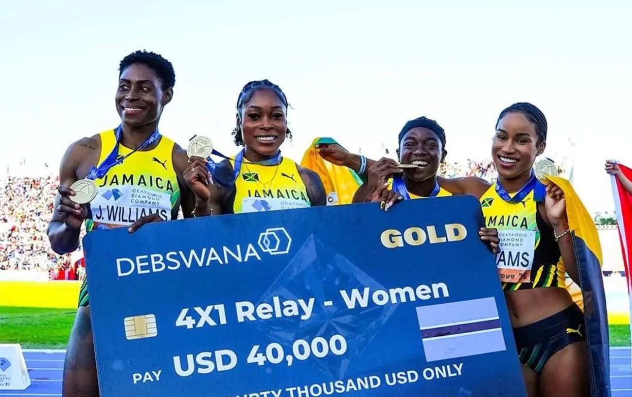








Its an image from science fiction dystopian futures — that when you win a medal, it is plastered with an advertisement.
This is also gross if you are earned a medal and you also loathe BoA; given that it has paid so many fines for unethical practices and was a major cause of the 2008 global financial disaster.
A quick google image reveals that BoA stamped its brand on other medals, such as the Chicago Marathon (but that one is all medal, no color to bring attention to the BoA logo). Just wonder why the Boston Marathon is the organization that objected.